How A Designer Flips Her Own New Home Part 3
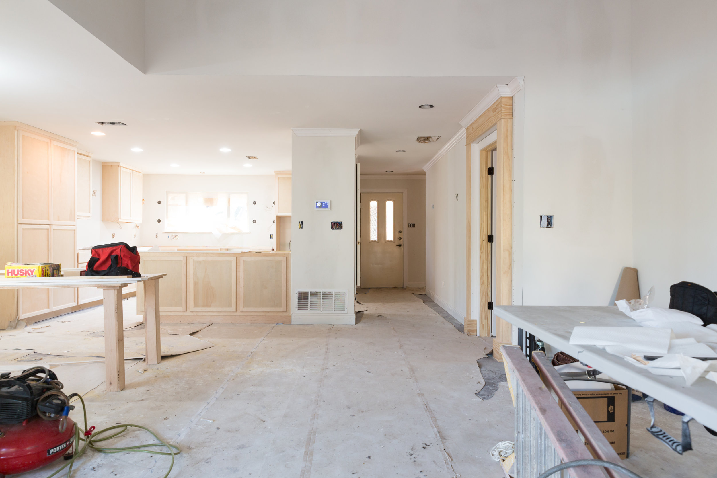
What happens when a busy designer decides to start fresh and remodel her own new home? Last fall, our designer Janice Hanks decided it was time for a change, and we’ve been following her progress on the blog. Already, the transformation is remarkable! (Be sure to read part 1 and part 2 of this series—you won’t believe the “before” photos!). The project is nearing completion as final selections are made, materials are installed, and furniture is ordered. Below are images of the space over the past few weeks along with some of Janice’s design selections.
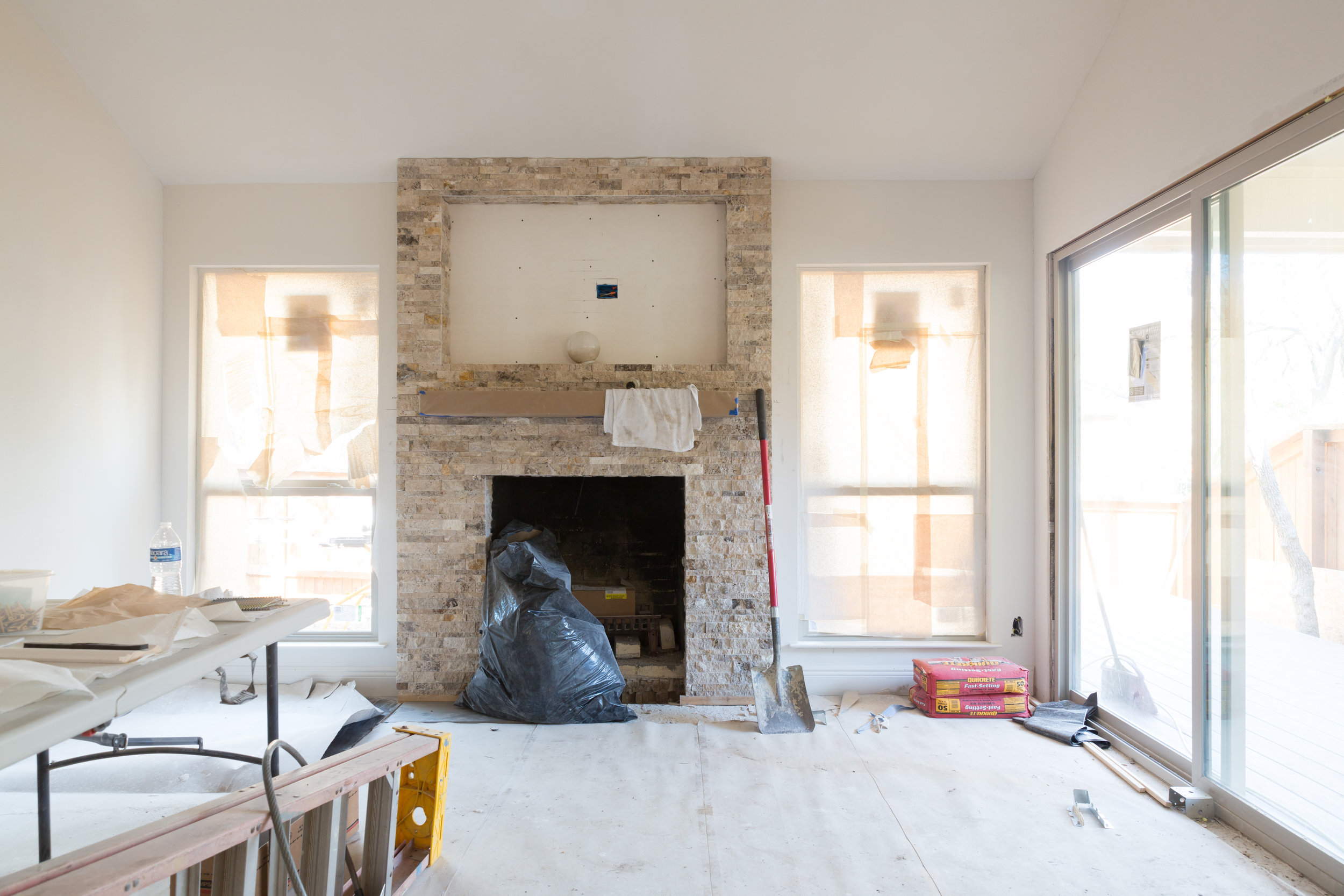
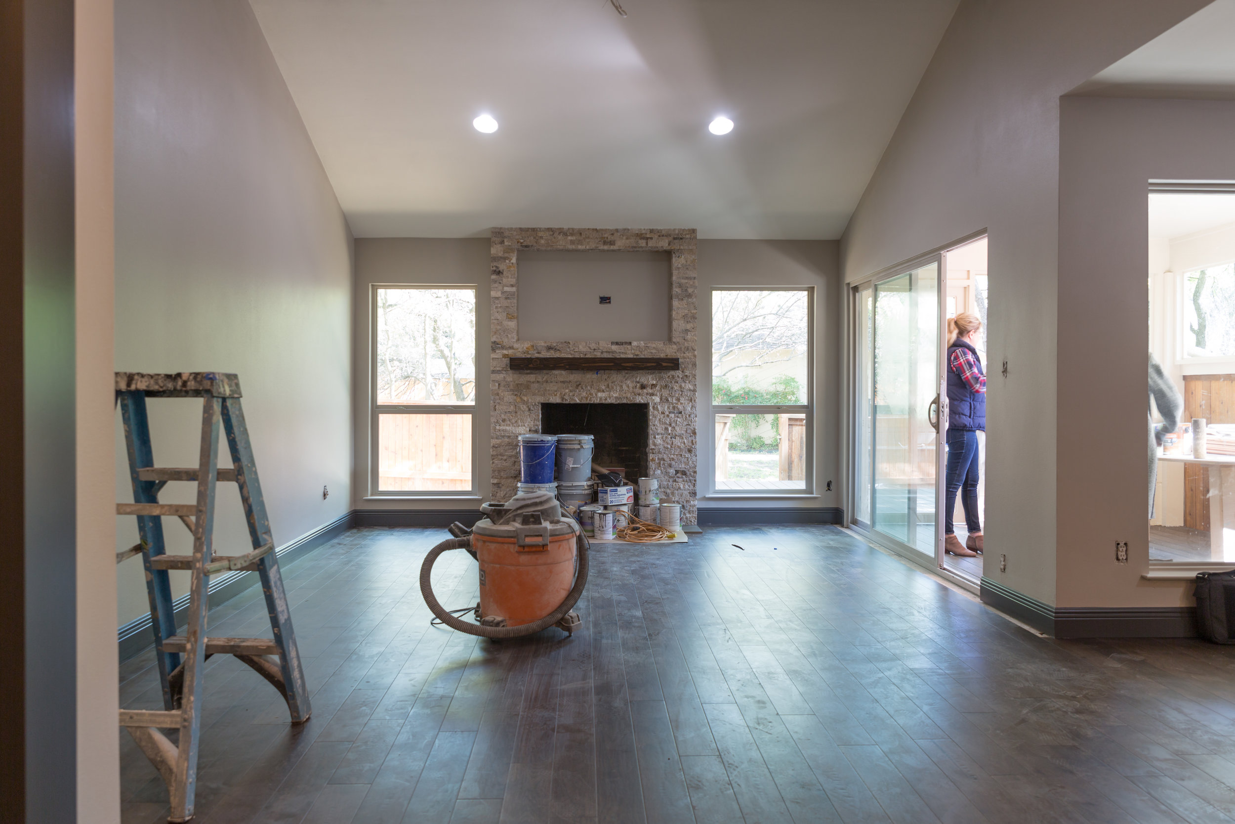
New chocolate hardwood flooring and a stacked stone fireplace facade add warmth and texture to the living room. In this shady neighborhood, light is important, so windows were upgraded and recessed can lighting was added to create the perfect foundation for Janice’s design.
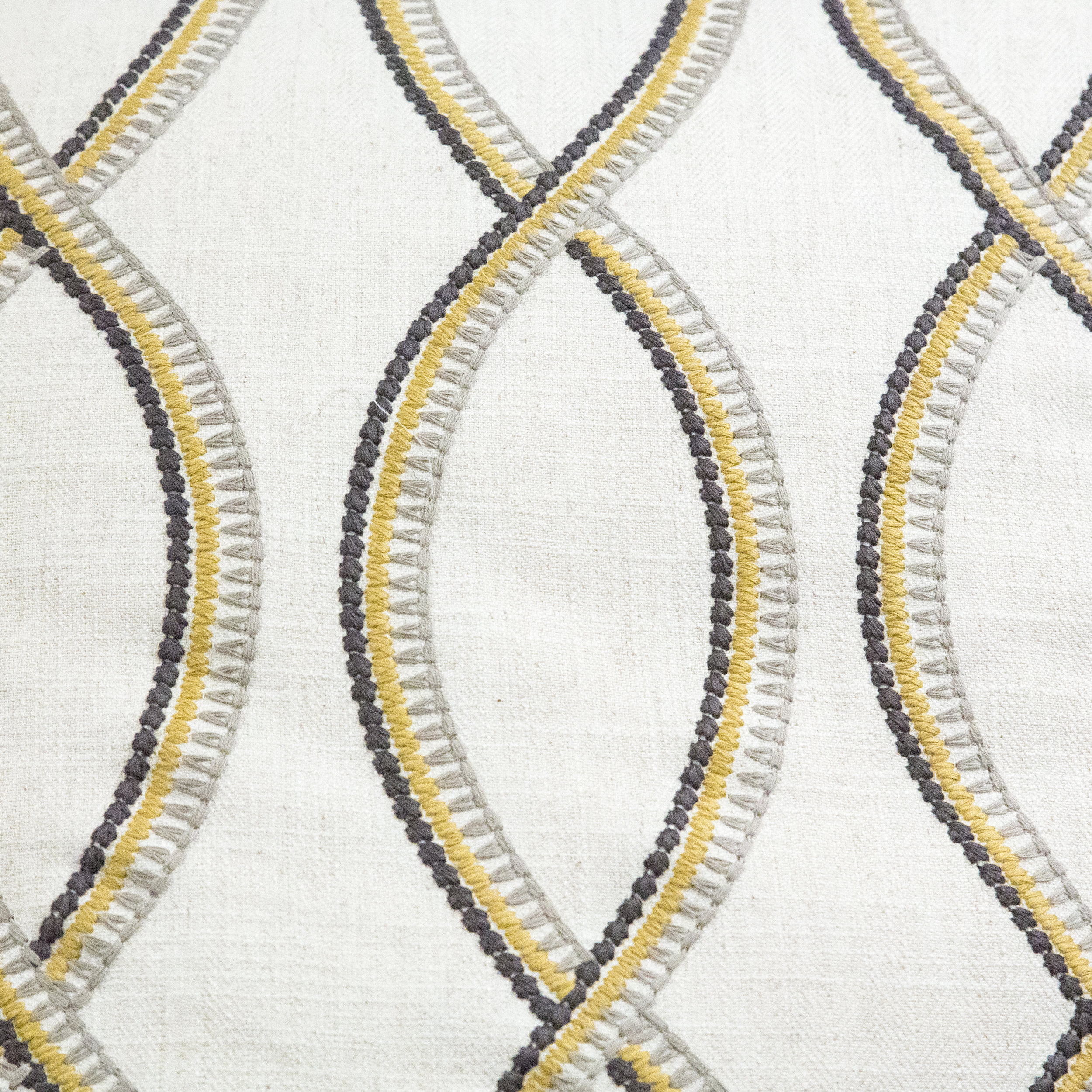
This painting served as color inspiration for the entire space. The muted golds and soft gray and blue hues are reflected in the fabric and wallpaper choices for the living room and entryway.
A picture window was added in the dining room, to look over the new sleeping porch and the wooded backyard.
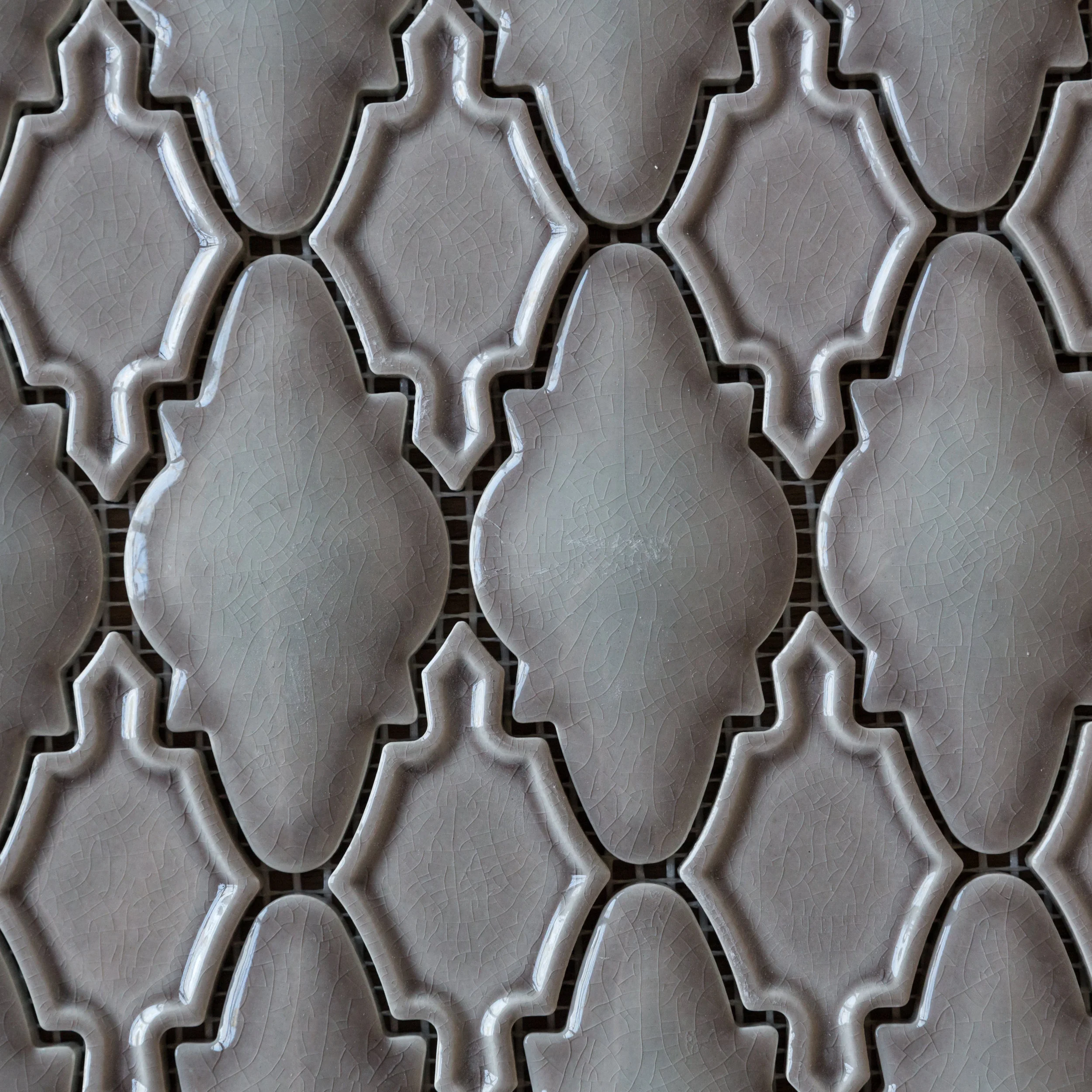
The cabinets were painted in a soft “Fog Mist” to balance the dark wood floors and keep the space feeling light and airy. The cabinet color accents the gorgeous Arabesque mosaic backsplash.
Janice selected the countertop granite first. Subdued but far from boring, the granite inspired the kitchen’s elegant color palette. Custom bar stools were upholstered in faux leather for easy cleaning, and a whimsical print fabric on the backs adds a little something unexpected.
The master bedroom is the ultimate sanctuary. Blues and grays evoke a calm and relaxing feeling and create the perfect place to unwind.
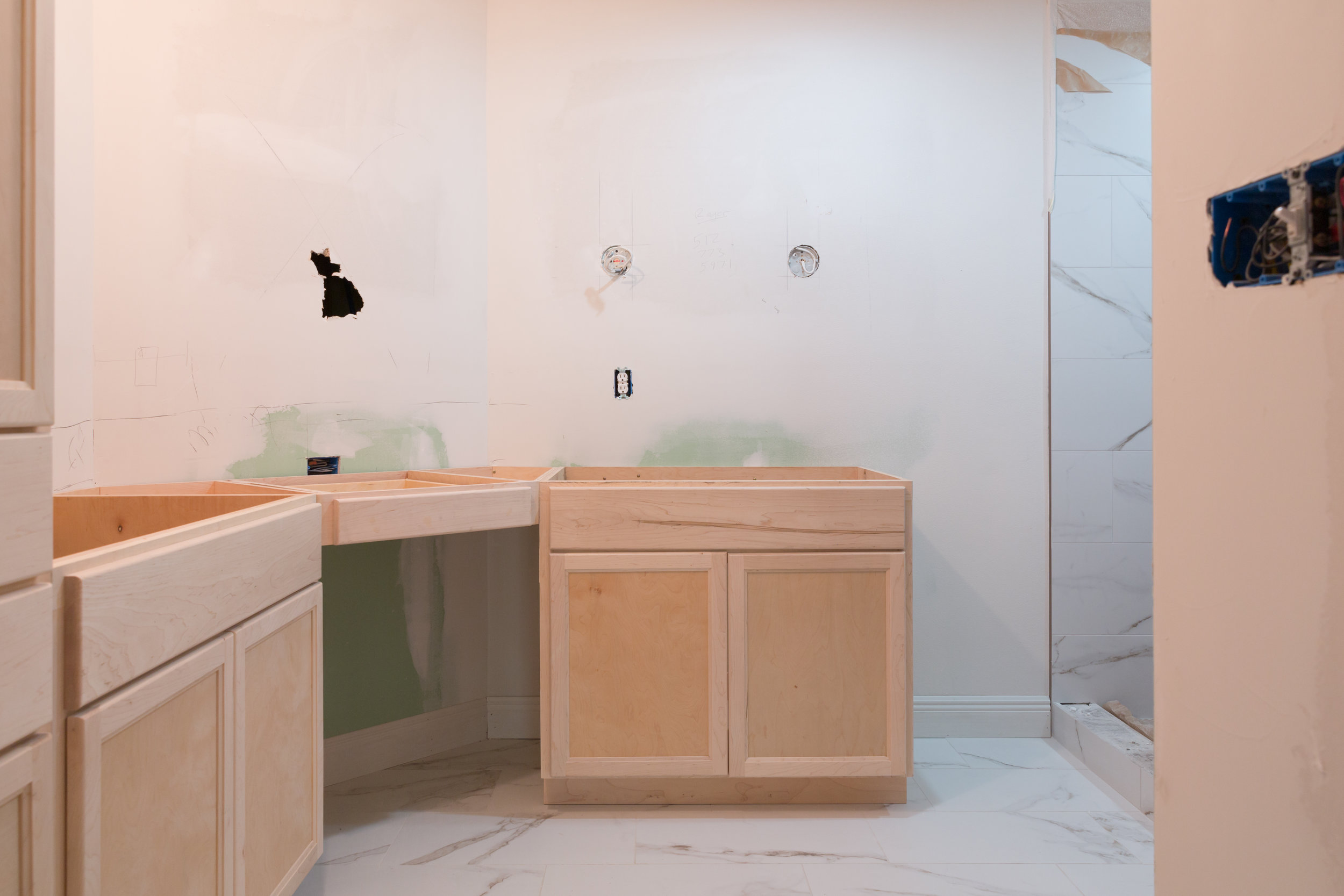
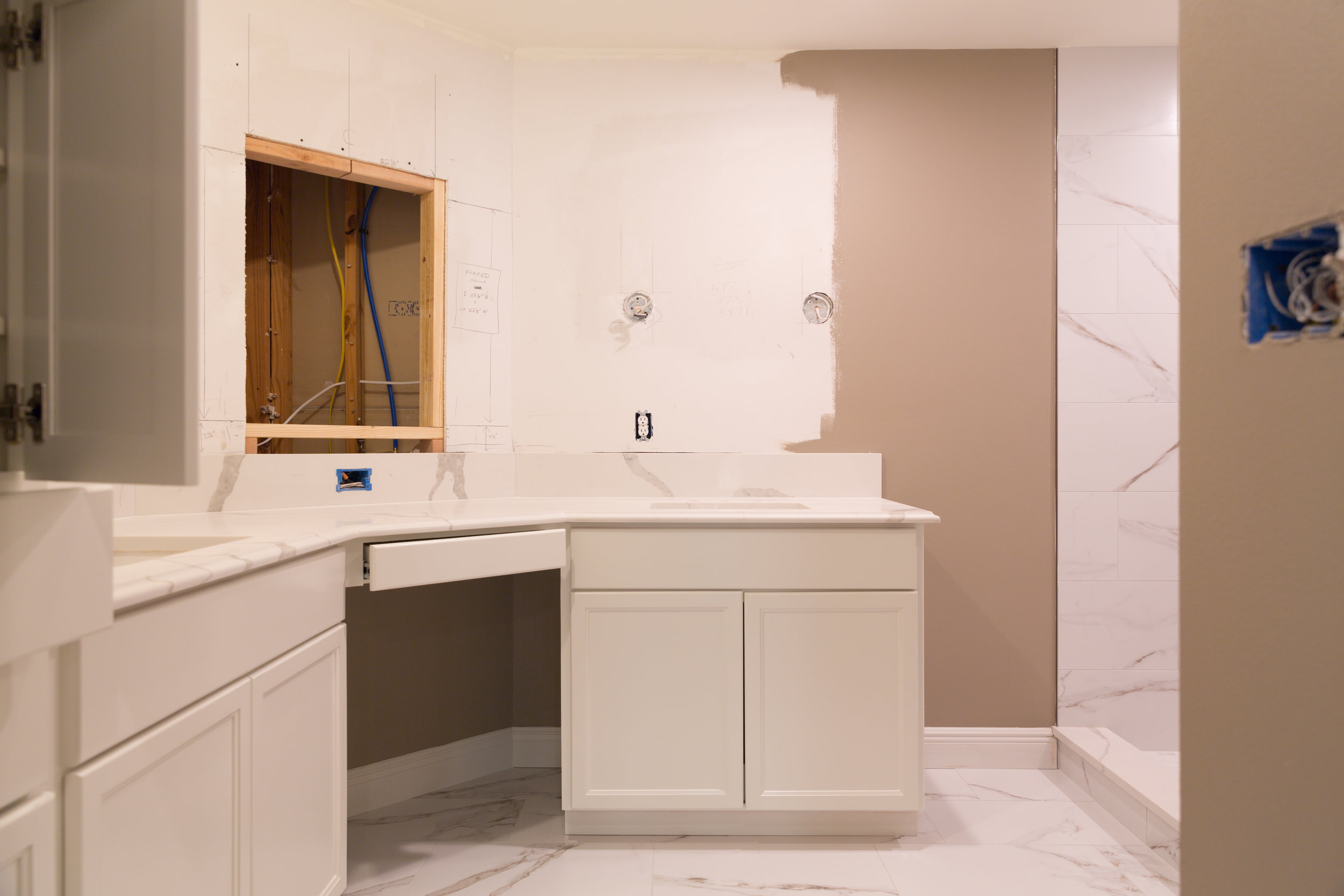
In the master bath, custom cabinets create lots of room for storage. Large vanity mirrors will be added to enhance the spaciousness.
The master shower, featuring an accent wall of hand-made tile, is one of Janice’s favorite design elements! The organic pattern made for a challenging installation, but it was worth the fuss for the impression that it makes.
Bathroom Tile Selections
The guest bath is one of the first rooms you see when entering the home and it definitely catches the eye. It features a gorgeous Ann Sacks blue tile placed in a herringbone pattern. A simple wash-stand style sink will be added for a classic, elegant finish.
Guest Bath Flooring and Tile Selections
The guest bedroom was expanded 2 feet into the garage to make the room bigger. New closets and a space-saving built in dresser and shelving create plenty storage space.
Knowing that the main visitors in this space would be her two young grandsons, Janice chose a darker color palette of black and navy to hide the inevitable marks and spills. Grays and golds tie into the colors from the rest of the house.
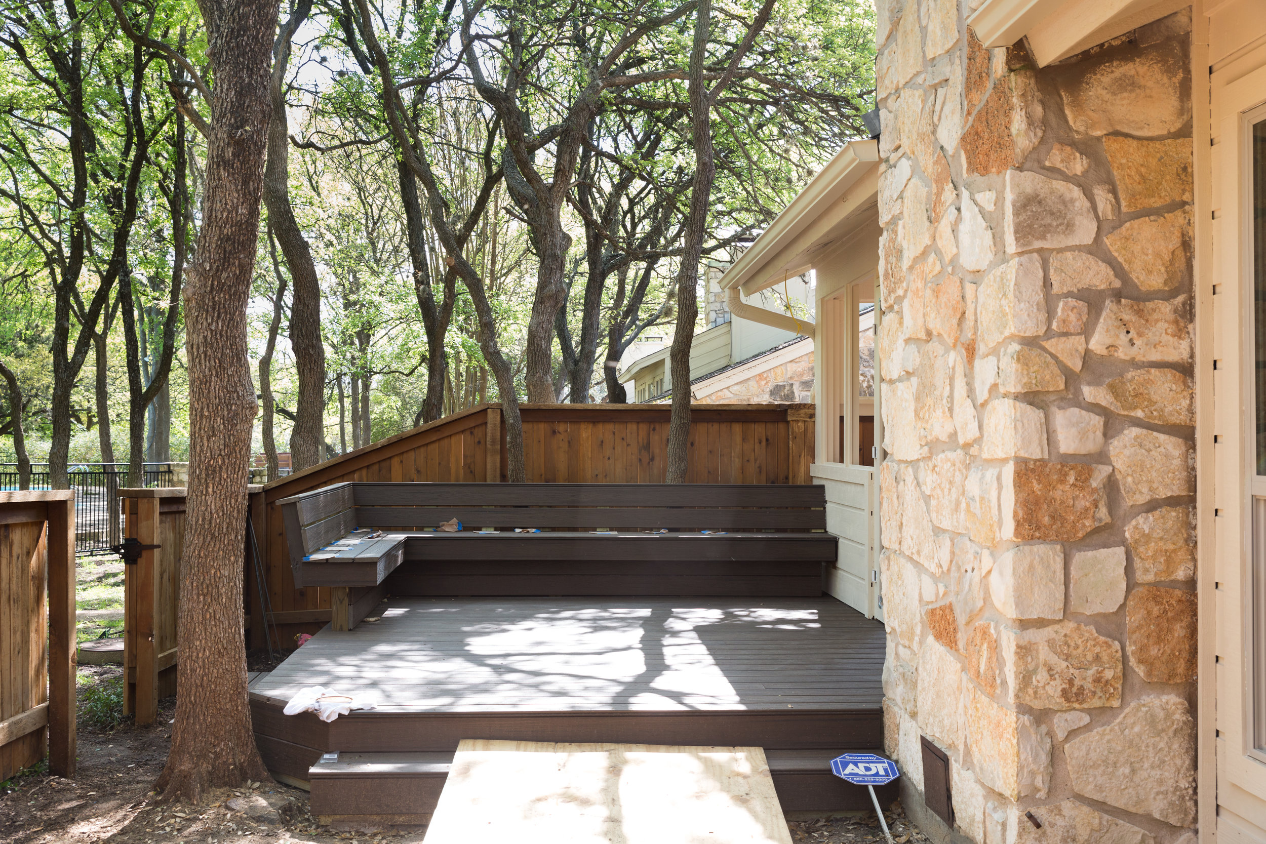
The back yard features the new addition of a screened sleeping porch and a deck with plenty of seating. The rest of the space will be landscaped with trees and shrubbery to help create privacy, and another seating area will be added along with a grill. This compact, thoughtful design proves that you can entertain graciously in a small space—no need to sacrifice when you down-size!
The transformation is nearly complete and Janice couldn’t be more thrilled! Her new neighbors stop by frequently to comment on the revival of this once-dated town home, and mention how fun it is to see the possibilities for their own spaces. Like many homes in Austin, this spot was a diamond in the rough. Located in a quiet but centrally located neighborhood, surrounded by mature trees, and featuring great “bones”, it was just waiting for someone to recognize it’s potential.
This project is completed. Click here to view the finished product.

